
illustrations
I still put a pen to paper and draw, or a brush, or a pencil, or some other traditional art media, even in this electronic age. I also use my computer to create pieces of artwork I used to create with traditional media. In either case, it's a specialized piece of artwork necessary to, literally, "illustrate" a point in communications. Many of these illustrations are in traditional media, especially ink, several began that way then I saw need to re-create them on the computer.
Scroll down to see these illustrations and read a little about each one (sorry, little icons are not clickable--yet!):


![]()


![]()
![]()
![]()


![]()
Andrew Carnegie Free Library Book Party Brochure Illustration
This is a regular customer, but for this project I get to use something other than my photographs, and I get to try out my skills in illustrating for children. I wanted the cover of the brochure to look like the cover of a fun book. The building is a stylized version of the library itself done in bright pastels.


Heal Your Heart Pet Loss CD
After the loss of so many cats it's healing now to be a part of a loving and sincere effort on the part of someone who is a licensed counselor and has prepared a recording and book of inspirational readings and information and affirmations for those who have also lost a pet. The main illustration is the cover of the CD and book, the other illustrations are for the back and interior pages of the book. The illustrations are done in watercolor, and the text is layered on top in InDesign.


Voices Carry Auberle Benefit Event
This project was done for one of my print broker customers. The event is an evening of karaoke as a benefit fundraiser, so I combined a silhouette of a singer with the falling stars background, all in the customer's colors. It was a hit!
Story Illustrations
This customer is outlining a series of children's books, and decided a sample illustration would help in his meeting with a potential publisher. I get to use my pastels in a whole new way. Yes, Santa really is flying over a small island.
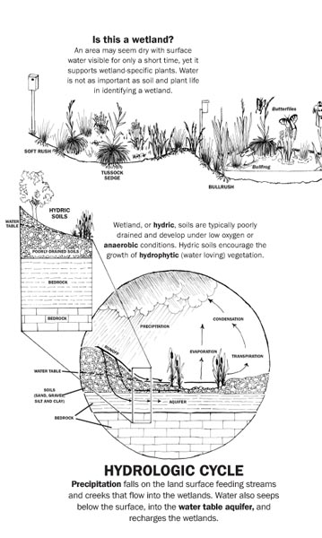
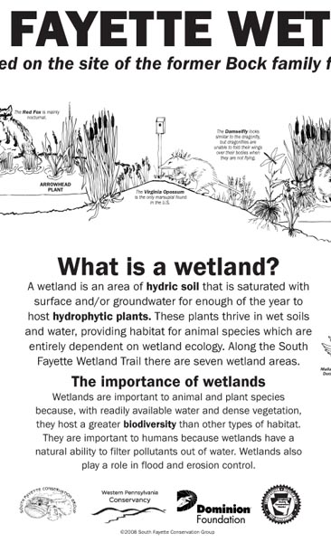
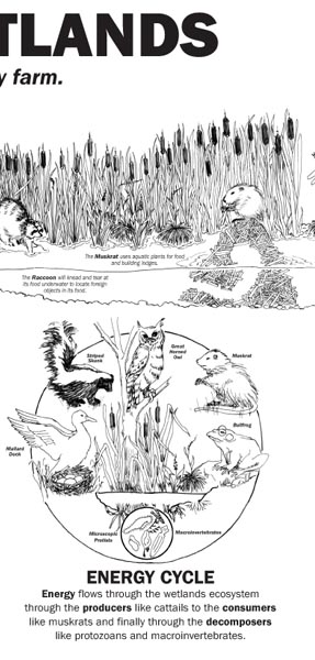
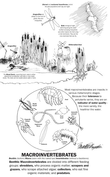
Interpretive Sign, South Fayette Conservation Group Wetland
This interpretive sign is 48" x 24", an ink illustration of cutaway view of actual wetland, flora and fauna and explanatory vignettes added for educational purposes. Creating the sign was a collaboration with group members to determine the content. The final image with text was output and laminated on a high-quality resin sign with cast pedestal, permanently installed at the wetland. Please visit the South Fayette Conservation Group customer page for more materials incorporating this logo and colors, including business cards, training certificates and a website.
ENLARGED VIEWS from left to right: 1
2
3
4
5
Logo Illustration, South Fayette Conservation Group
I had originally drawn this illustration just to show what content could be included, and decided to experiment with a style of handling my crow-quill pen, but I never dreamed anyone would want to use an ink illustration this detailed. I was always concerned that it was too detailed to use small, or to use with colors, but we've managed to use it in a variety of ways. It was designed in coordination with the organization's board of directors. The elements represent the assets found in the community that are of interest to a conservation organization: agriculture, hiking on trails, canoeing on the creek, wetlands, woods and hills. Please visit the South Fayette Conservation Group customer page for more materials for this customer.
Story Illustration, Vistas Newsletter, Allegheny Land Trust
I edit and design this newsletter three times a year, and decided that this reflective commentary needed a watercolor illustration instead of a photo or electronic illustration to accompany. The content is drawn from reading the story. Please visit the Allegheny Land Trust customer page to see other products.

Join the Choir (singing the praises of land conservation), Allegheny Land Trust Appeal
This illustration was the brainstorm of the executive director, who said he'd like an illustration to be used in fundraising appeals for Wingfield Pines, one of their properties. The illustration should include a representative number of species who live on the property, all with their races raised in song, inviting others to "join the choir" singing the praises of land conservation. It's an ink illustration and I've added electronic color. Please visit the Allegheny Land Trust customer page to see other products.
Wingfield Pines Remediation Plan Diagram, Allegheny Land Trust
We needed to take this highly technical plan for remediating abandoned mine drainage on the property and make the basic concept quickly and easily understood, creating an icon for the idea. I began on paper with an outline sketch, but as we began changing details of color and layout I decided to move to the computer where revisions are so much easier to make. Please visit the Allegheny Land Trust customer page to see other products.
Venn Diagram Icon, Allegheny Land Trust Appeal
A Venn diagram is a common tool for determining priorities among a diverse group of choices. In this case, the choices were among lands that held special characteristics of water quality, biodiversity or regional character, so the Venn was designed to be used in two ways, with icons and with text, depending on context. Please visit the Allegheny Land Trust customer page to see other products.

Jazz at CarnegieCarnegie Hall, for Andrew Carnegie Free Library & Music Hall's concert series
The image of the grand piano is actually the one on the stage in the hall, and the musicians at the bottom are the group that plays at a local gallery who would be playing this concert. The facility's colors are orange and black, and rather than go with a collage of photos a collage of posterized images blended together, and the word "Jazz" came together nicely in the slightly swashy italicized variation of Garamond. Visit Andrew Carnegie Free Library & Music Hall customer page for more designs including this logo.
Democracy in Action, debate at Andrew Carnegie Free Library & Music Hall
In a presidential election year, how to make a debate among local groups look different from the rest? Use the actual stage where the debate will be held, the one in Andrew Carnegie Free Library's Music Hall, complete with proscenium arch.Visit Andrew Carnegie Free Library & Music Hall customer page for more designs including this logo.
Carnegie Community Development Corporation artwork
In collaboration with the artist directing the organization's identity project who chose the colors and pointed out the "Carnegie Renaissance" logo (below) as one they liked, I chose to create an original electronic illustration patterned on an actual block of buildings in Carnegie, drawn and colored on my computer.
Max's Specialty Sandwich Shoppe
I chose from available clip art a sandwich that resembled one the owner might make, then we set about making the cheese and lunchmeat as they would be on a real sandwich, changed the bun, added lettuce...
Carnegie Renaissance
I was one of the founding members of this organization; I had the idea for this logo when we first began discussing the organization, and I chose to create an original electronic illustration patterned on an actual block of buildings in Carnegie. Ironically, Carnegie lost a good portion of this block in a fire in 2005, so here it's commemmorated in the logo. I've included four icons created in a similar style that are used on the website, also based on actual buildings in Carnegie. Please visit the Carnegie Renaissance customer page for more designs incorporating this logo and its elements.
![]()
![]()
![]()
![]()
![]()
Carnegie, Bursting with Culture
One of the ideas behind marketing Carnegie was to advertise its cultural assets--at least four galleries, a music school, and artists of all sorts who live in and around town. This logo is an original ink illustration enhanced with type that was inspired by listening to the music from the annual Arts & Heritage Festival on Main Street from my deck, and all the little icons represent what Carnegie has to offer in the arts. Please visit the Carnegie Renaissance customer page for more designs incorporating this logo and its elements.
Seen Around Town, the Carnegie Arts & Heritage Festival logo
There's a dome with a three-bar cross, musical notes, a palette, the clock, a striped tent, all the things that go into our festival. It's an original electronic illustration with type enhancement; I drew all the individual elements. Please visit the Carnegie Arts & Heritage customer page for more designs including this logo.
Ink Illustrations in 40s Style, Historical Construction Equipment Association
These illustrations are reminiscent of a style of the 1940s when many books were written for and about the construction industry. Over several years we designed several items that incorporated these illustrations. For the main logo, the client chose his three favorite pieces of equipment and asked that I sketch them and place them in a realistic setting considering their use, but one that would also fit the logo layout.


Kittyland, My Three Cats & Co., Inc.
Reminiscent of CandylandT, but different enough not to be a copyright infringement, I created the logotype and the board base. All the other elements were added in the graphics program to make for easier product changes later. Please visit the My Three Cats & Co., Inc. customer page for more materials for this customer.

Bogey's Letterbox, My Three Cats & Co., Inc.
Bogey is the "shop cat", and all mail directed to him went directly into his "letterbox". The illustration is in ink using a crow-quill tip, then color added later in PhotoShop. Please visit the My Three Cats & Co., Inc. customer page for more materials for this customer.
My Three Cats Welcome, My Three Cats & Co., Inc.
These are the three cats for whom the store is named, and when I originally designed the website I made a collage of the three images. Later we decided they should be decorated for the seasons and holidays. Please visit the My Three Cats & Co., Inc. customer page for more materials for this customer.
Mortar and Pestle, Westbrook Pharmacy Logo
Of all the mortars and pestles out there, I couldn't find the one I wanted to use for this logo, so I drew it, then scanned and tightened it up. Please visit the Westbrook Pharmacy customer page for more materials incorporating this logo and colors..
Healing Hands, Renewal Professional Therapies
This practitioner specializes in non-traditional healing methods as well as traditional massage, and felt that hands should be a prominent part of the logo. I actually sketched my own left hand, then rendered it in ink.
![]()
